Accordion
Accordion is a user interface element that displays content in collapsible sections. Each section has a header that can be clicked to expand or collapse its contents. Accordions are commonly used to organize and display information in a space-efficient way, making it easy for users to find what they're looking for.
How to add block
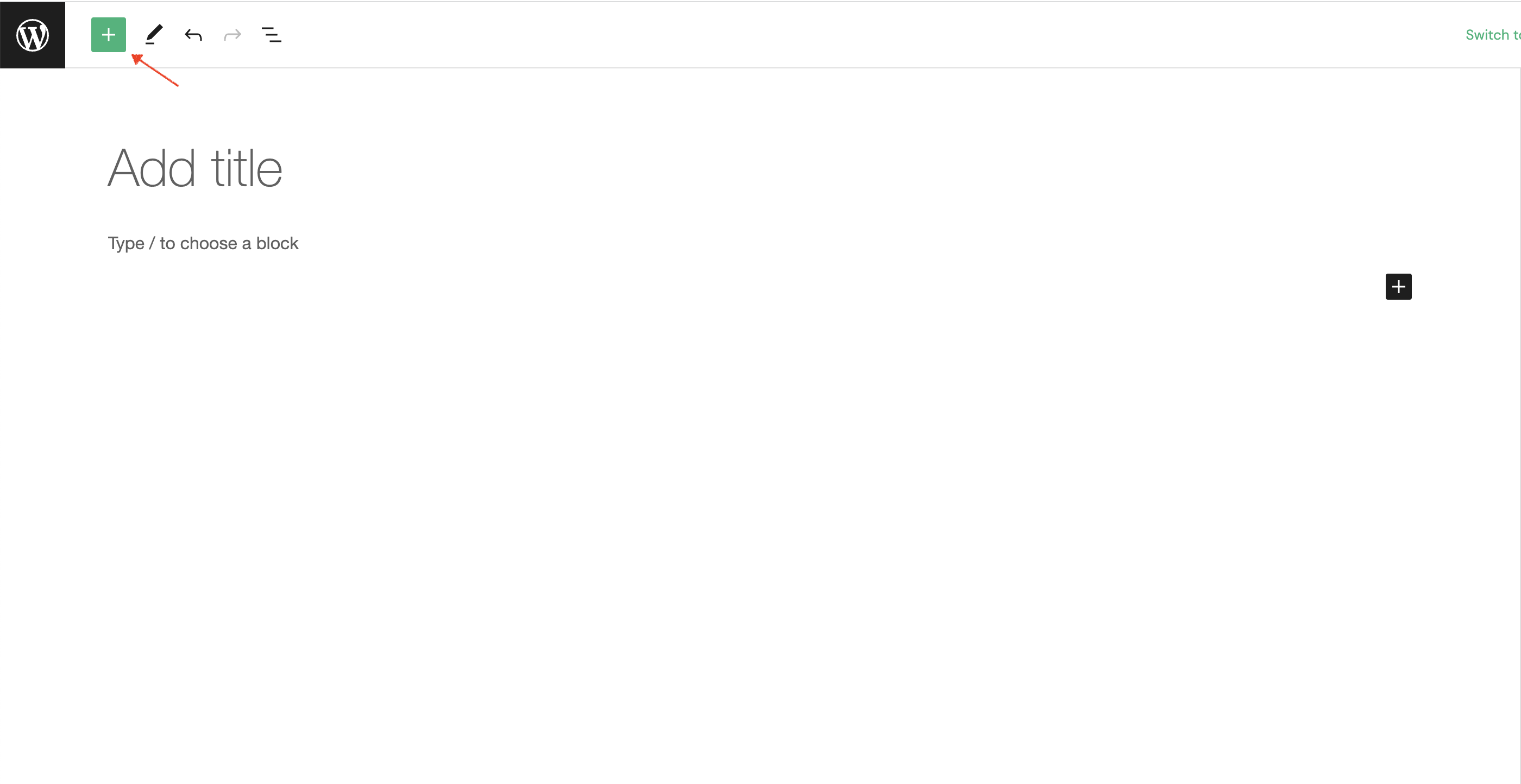
To add accordion block to your page, click on the Block Inserter icon.
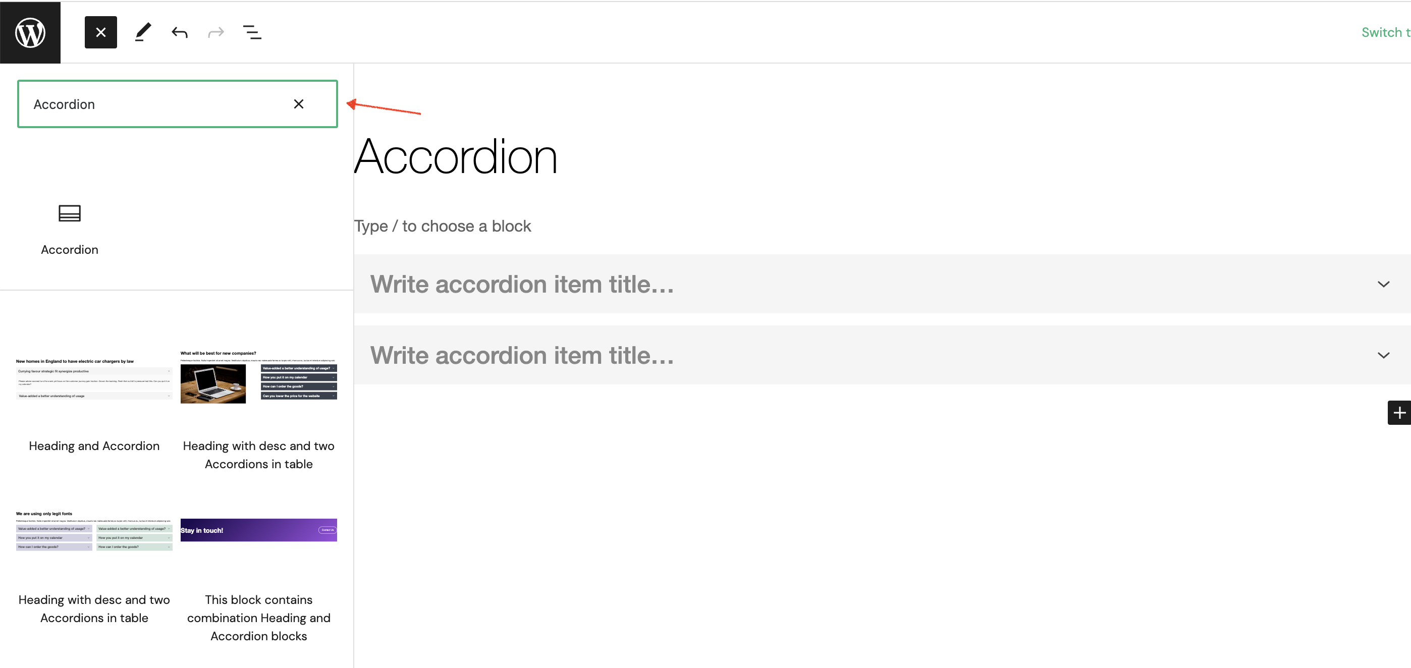
The next step is to type accordion into search input field.
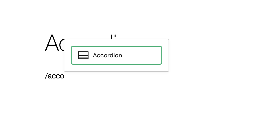
Alternatively, you can use the slash command /accordion in a new paragraph block then press enter to add one quickly.
Block Toolbar
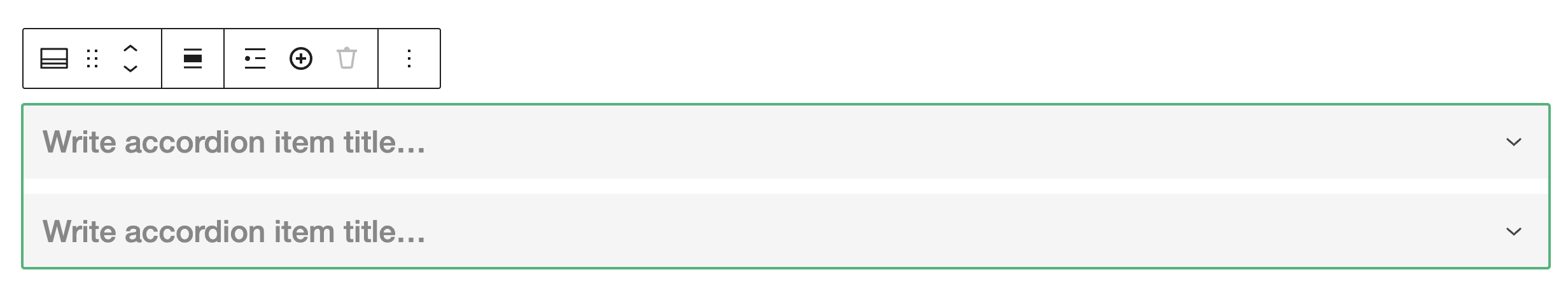
Every block comes with unique toolbar icons and block-specific user controls that allow you to manipulate the block right in the editor.
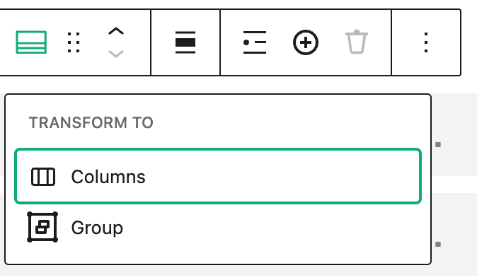
Transform to
- Columns - transform block or group of blocks into a multi-column layout, where you can choose the number of columns and their width.
- Group - transform block or group of blocks into a single group.
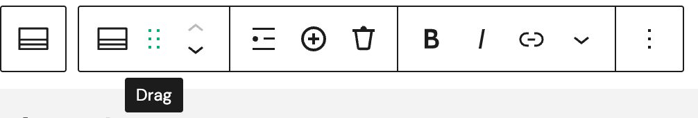
Drag
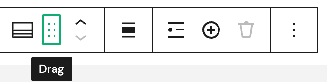
- Drag - move easily block of content around the page or post by dragging and dropping it with mouse or touchpad.
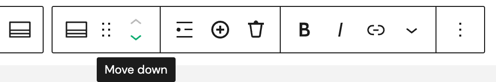
Move up/down
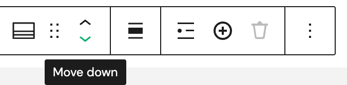
- Move up - quickly change the position of a block (up) in the block editor without having to drag it manually.
- Move down - quickly change the position of a block (down) in the block editor without having to drag it manually.
Container size
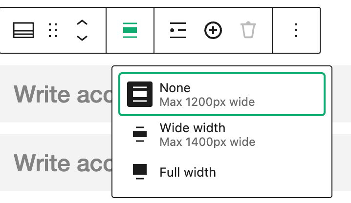
- None - this alignment option does not apply any horizontal alignment to the block content. The content will be displayed in its default width (max 1200px wide) and position, as determined by the surrounding content.
- Wide width - expand the block content to a width that is wider than the default, but not as wide as "Full width" (max 1400px wide). This can be useful if you want to create a more spacious layout that still fits within the boundaries of your website or page.
- Full width - stretch block content to fill the full width of the screen or container in which it is displayed. This can be useful if you want to create a full-width layout or if you want to emphasize the visual impact of your content.
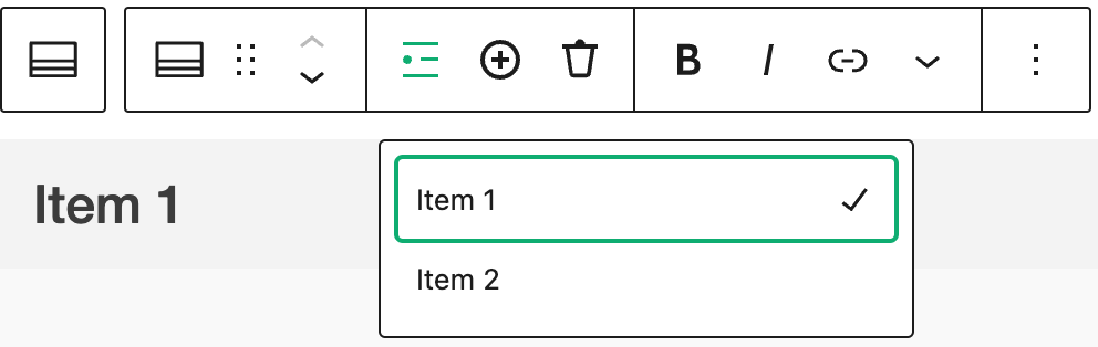
Select item
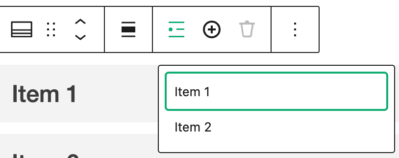
- Item - select individual Accordion Item within a Accordion by clicking on it.
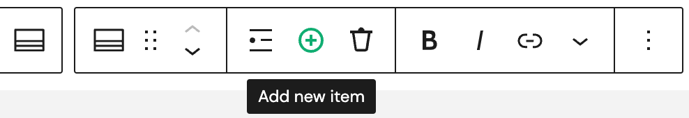
Add new item
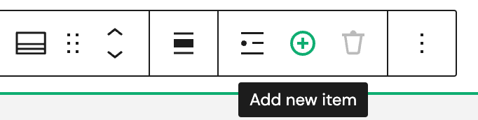
- Add new item - add new Accordion item to your page or post and customize content as needed.
Options
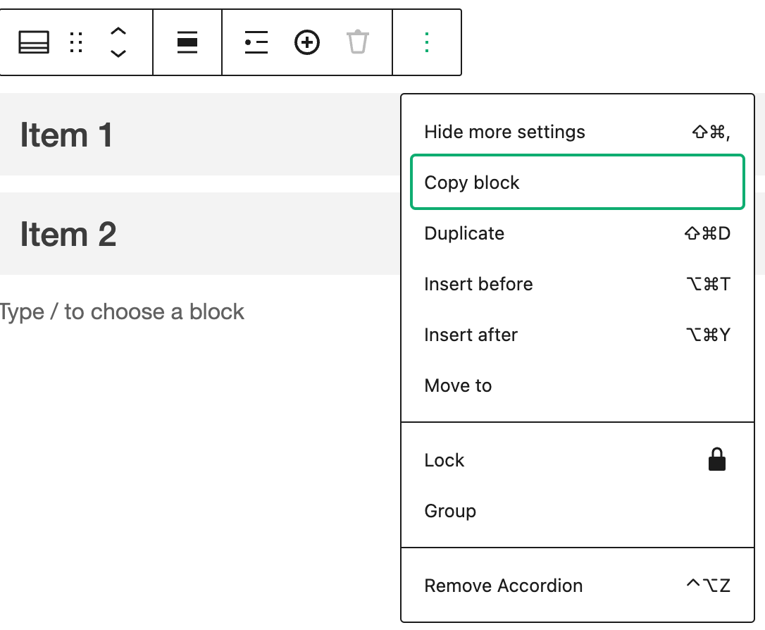
- Hide more settings - hide or show advanced settings of the block.
- Copy block - create a duplicate of the current block you're working with. You can then paste this block elsewhere in your content, or use it as a starting point for creating a similar block.
- Duplicate - duplicate of the block that you're working with. This can be useful if you want to reuse a similar block elsewhere in your content.
- Insert before - insert a new block after the current block you're working with.
- Insert after - insert a new block after the current block you're working with.
- Move to - move the current block to a different location within your content. When you click "Move to," you'll see a list of available locations where you can move the block. This can be useful if you want to rearrange the order of your content or move a block to a different section of your page.
- Lock - lock current block, preventing it from being edited or moved. This can be useful if you want to prevent accidental changes to a specific block, or if you want to keep a block in a fixed location on your page.
- Group - group selected blocks together into a single unit. You can then manipulate the group as a whole, making it easier to move or arrange multiple blocks at once.
- Remove Accordion - delete the current block from your content.
Block Settings
Block settings in Gutenberg blocks refer to the specific settings that are available for each individual block. These settings are located on the right-hand side of the editor when you select a block.
The block settings that are available will vary depending on the type of block you are editing. For example, if you are editing a paragraph block, the block settings might include options to adjust the font size, line height, and text color.
Accordion Settings
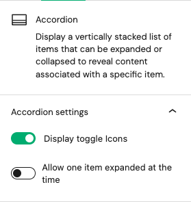
- Display toggle icons - hide or show icon on each Accordion items.
- Allow one item expanded at the time - when a user clicks on a different item to expand it, any previously expanded items will automatically collapse.
Header Settings
Header settings
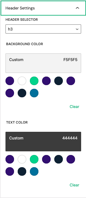
- Header selector - apply different levels of heading styles to Accordion item title (default h3).
- Background color - set a background color for an accordion item title. More information on colors settings overview
- Text color - set a text color for an accordion item title. More information on colors settings overview
Content Settings
Content settings
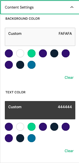
- Background color - set a background color for an Accordion item content. More information on colors settings overview
- Text color - set a text color for an Accordion item content. More information on colors settings overview
Advanced
The Advanced tab lets you add optional settings to your Block.

Additional CSS class(es) lets you add CSS class(es) to your block, allowing you to write custom CSS and style the block as you see fit.
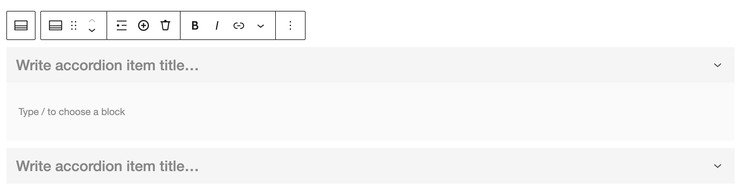
Accordion Item
Every block item comes with unique toolbar icons and block-specific user controls that allow you to manipulate the block right in the editor.
Select Accordion
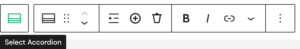
- Select Accordion - select parent block (Accordion)
Drag
- Drag - move easily block of content around the page or post by dragging and dropping it with mouse or touchpad.
Move up/down
- Move up - quickly change the position of a block (up) in the block editor without having to drag it manually.
- Move down - quickly change the position of a block (down) in the block editor without having to drag it manually.
Select item
- Select Item - select individual Accordion Item within a Accordion by clicking on it.
Add new item
- Add new item - add new Accordion item to your page or post and customize content as needed.
Delete item
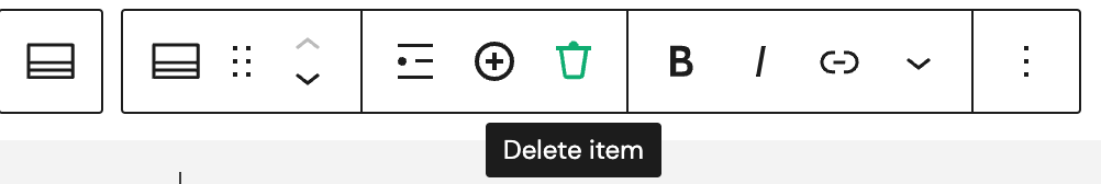
- Delete item - remove current Accordion item from your Accordion block.
Bold
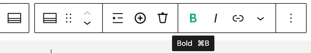
- Bold - apply bold formatting to the Accordion item title.
Italic
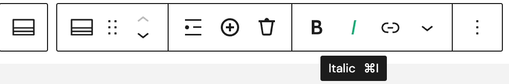
- Italic - apply italic formatting to the Accordion item title.
Link
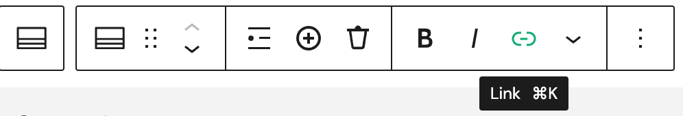
- Link - create a hyperlink to another page or website within Accordion item title.
More
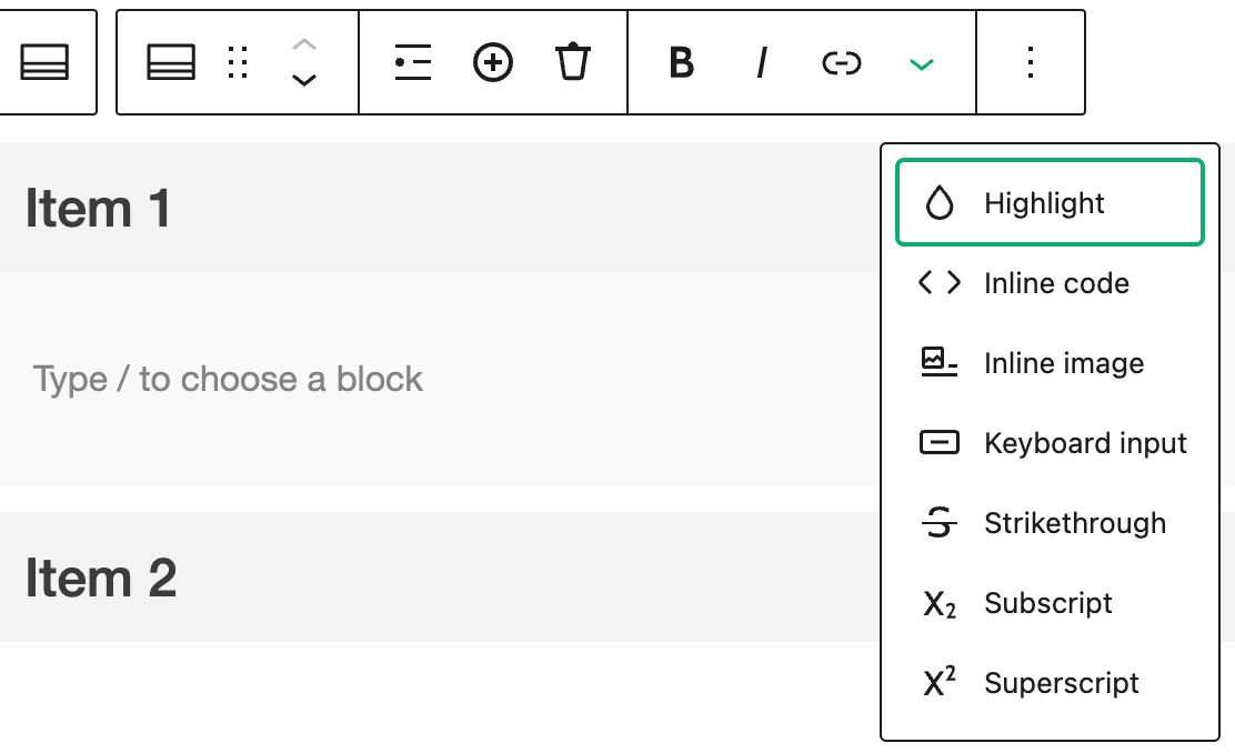
- Highlight - apply a colored background to selected text in a block. This can be useful for calling attention to specific parts of your content.
- Inline code - format selected text as code within a block. This can be useful for displaying code snippets or other types of computer code in your content.
- Inline image - insert an image directly into a paragraph or other text-based block. This can be useful for adding visual interest to your content or illustrating a point.
- Keyboard input - format selected text as keyboard input within a block. This can be useful for displaying keyboard shortcuts or other types of input instructions in your content.
- Strikethrough - apply a strikethrough effect to selected text within a block. This can be useful for indicating that certain text has been deleted or is no longer valid.
- Subscript - format selected text as subscript within a block. This can be useful for displaying mathematical formulas or chemical equations, where subscript text is often used.
- Superscript - format selected text as superscript within a block. This can be useful for displaying mathematical formulas, chemical equations, or other types of content where superscript text is often used.
Options
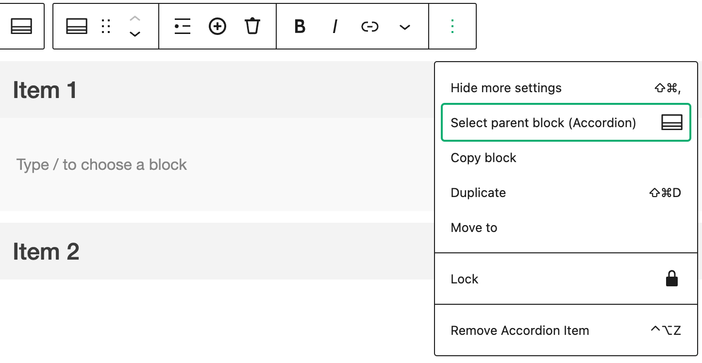
- Hide more settings - hide or show advanced settings of the block.
- Select parent block (Accordion) - select the parent block of the currently selected block.
- Copy block - create a duplicate of the current block you're working with. You can then paste this block elsewhere in your content, or use it as a starting point for creating a similar block.
- Duplicate - duplicate of the block that you're working with. This can be useful if you want to reuse a similar block elsewhere in your content.
- Lock - lock current block, preventing it from being edited or moved. This can be useful if you want to prevent accidental changes to a specific block, or if you want to keep a block in a fixed location on your page.
- Remove Accordion Item - delete the current block from your content.
Settings
Accordion Item Settings
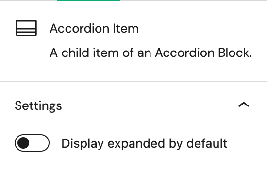
- Display expanded by default - if this option is selected, the content section of selected Accordion item will be expanded and visible when the Accordion loads.
Advanced
The Advanced tab lets you add optional settings to your Block.
Additional CSS class(es) lets you add CSS class(es) to your block, allowing you to write custom CSS and style the block as you see fit.